


Hot take (extremely literal, given the temperatures): summer is not a great season for most people’s wardrobes, and I’m including people who have already done their colour analysis in this statement. You spend months building a considered palette, you finally feel like you understand what works on you, and then July arrives and suddenly your only options seem to be “sweating through something linen-white that isn’t quite your white” or “suffering in the correct colour.” Neither of these is a good time.
I want to talk about the real practical challenge of dressing for summer heat without just quietly abandoning everything your colour analysis told you, which I suspect a lot of people do between June and September and then feel faintly guilty about.
First: fabric, because fabric changes everything in summer, and not just for comfort reasons.
The same colour reads differently depending on the fabric it’s printed or woven into, and this effect gets more pronounced in summer materials. A cool dusty blue in a heavy cotton jersey reads one way. The same shade in a floaty chiffon reads softer, lighter, almost faded - which might move it slightly outside your optimal range even if the colour name is technically the same. Conversely, a warm coral that would be too bright and overwhelming in a heavy fabric can become perfectly wearable in a lightweight linen that diffuses the saturation slightly.
The practical upshot: don’t assume that because a colour is in your palette as a concept, any version of it in any fabric will work equally well. Summer fabrics, especially anything very sheer, floaty, or loosely woven, tend to soften and lighten colours compared to heavier materials. If you’re a season that suits saturated, clear colours, you may need to size up slightly in intensity when buying sheer summer fabrics to achieve the same visual punch. If you’re a softer or more muted season, very lightweight fabrics can actually be your best friend, because the natural softening effect of the fabric does some of the work for you.
The white problem.
Here it is, the thing everyone wants to do in summer and the thing that is most variable by season: wearing white. Everyone wants to wear white in summer. It is a completely understandable impulse. It feels clean, it reflects heat, it reads as effortlessly summery in a way that a well-chosen dusty blue simply does not, at least not at the same gut-instinct level.
But as we’ve discussed before, “white” is not one colour. True stark white (cool and bright) is a Summer or Winter palette staple. Warm creamy white works better for Springs and Autumns. And for some seasons - particularly the very soft or very muted ones - even a carefully chosen white can be a bit much right at the face, simply because of the contrast issue rather than the undertone issue. The fix, as ever, is proximity. White linen trousers: nearly everyone. White sleeveless top right at the collarbone: depends very much on your season and your contrast level. A warmer cream or ivory wrap blouse: more forgiving across more seasons than true optic white.
The heat-specific styling problem nobody talks about.
When it’s very hot, you end up wearing less. Less fabric, less layering, fewer opportunities to put a good-colour cardigan between your off-palette top and your face. This is where summer is actually harder for colour analysis purposes than winter, when layering gives you all sorts of options for managing colours that aren’t quite right. In summer, it’s often just one layer, right there, nowhere to hide.
This is the argument for being more intentional about your summer basics than your winter ones, not less. Your summer tops - the ones you grab because it’s hot and you need something on - are the items that will be closest to your face with the least supporting cast around them. Getting those right is higher leverage than almost any other category in your wardrobe. A handful of simple, flattering-coloured summer tops will work harder for you than a carefully constructed winter layering situation, precisely because there’s nothing else in the frame.
Heat-specific tips by season type:
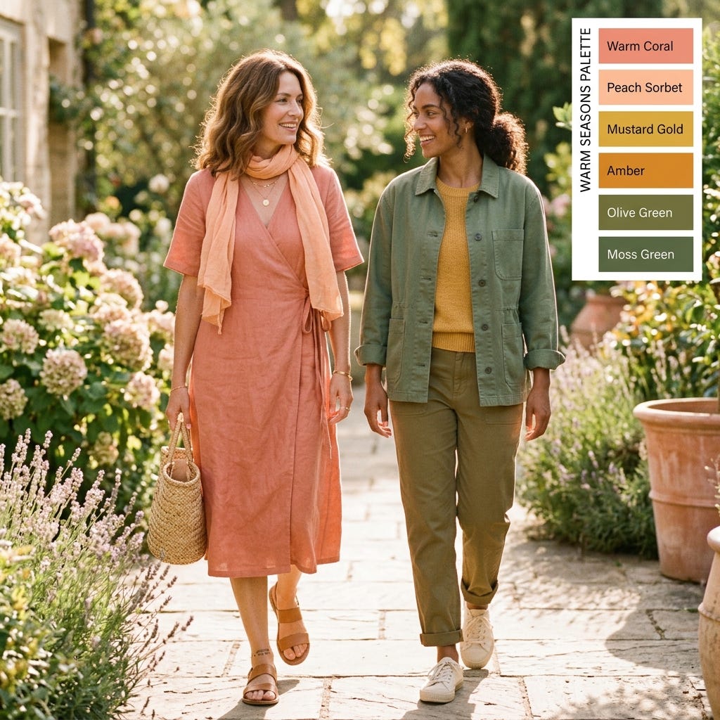
Warm seasons (Spring and Autumn): Your palette already includes a lot of the colours that feel instinctively summery - corals, warm peaches, golden yellows, warm greens. Lean into them. The main summer challenge for warm seasons is avoiding the drift toward the overly bright or overly saturated end that shops push in summer, which can skew too vivid for an Autumn or too sharp for a Spring. Warm but soft, warm but natural - that’s the sweet spot.
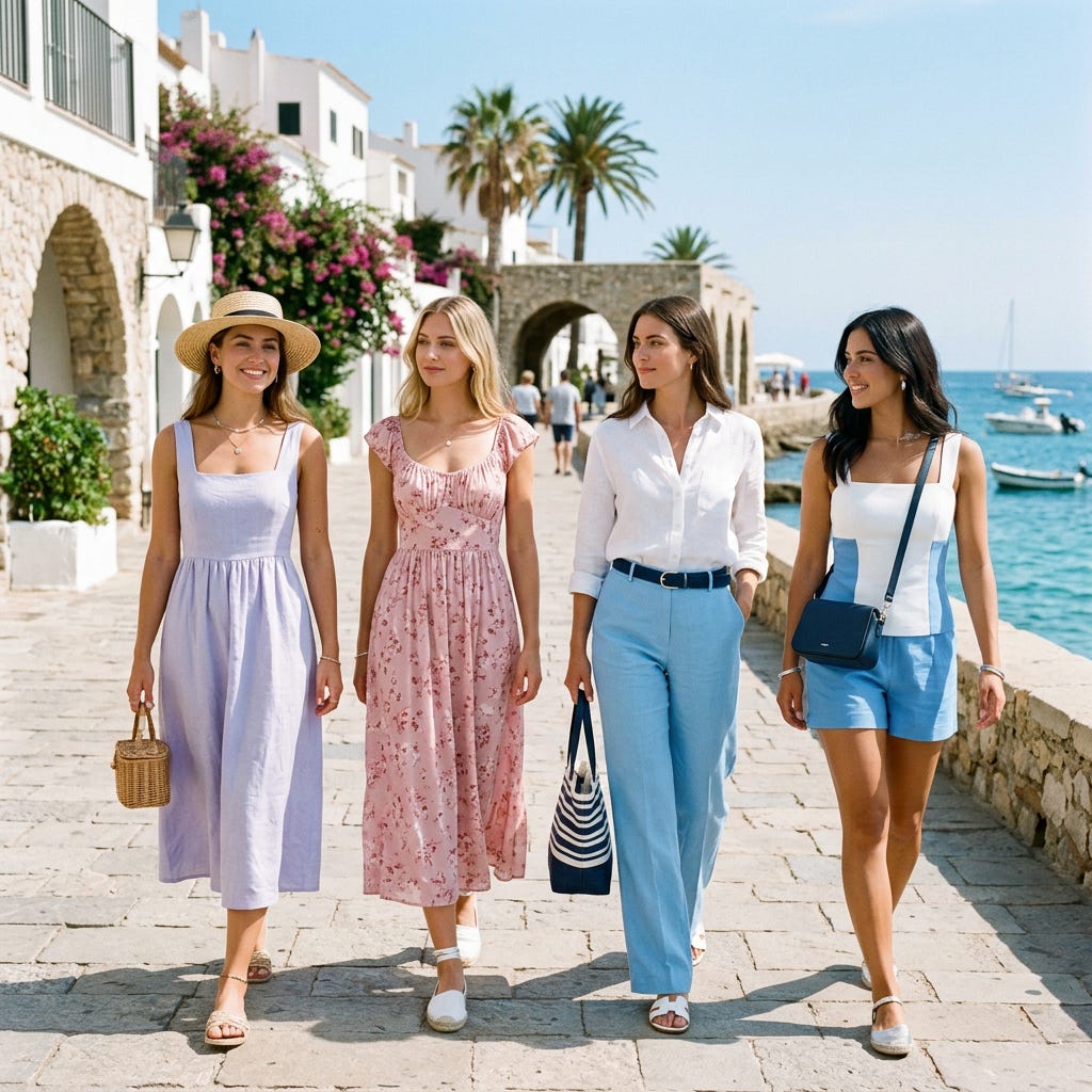
Cool seasons (Summer and Winter): Your palette includes a lot of colours that can read as slightly formal (navy, burgundy, plum) and not all of them scream “July” without some effort. Look for your palette’s lighter, airier versions — the icy lavenders, soft rose pinks, and clear sky blues for cool seasons tend to be both flattering and actually summery. For Winters, white (true cool white) and crisp colour-blocking are both summer-appropriate and very much in your wheelhouse.
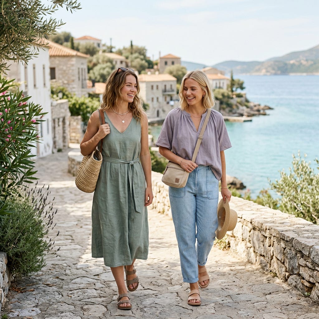
Soft or muted seasons: The good news: your palette’s soft, dusty quality is extremely wearable in heat because you’re not fighting bright, saturated colours that feel heavy even when the fabric isn’t. The challenge is that summer shops tend toward high-saturation brights that you need to sidestep almost entirely. Stick to the less shouting end of the summer palette and you’ll be well served.
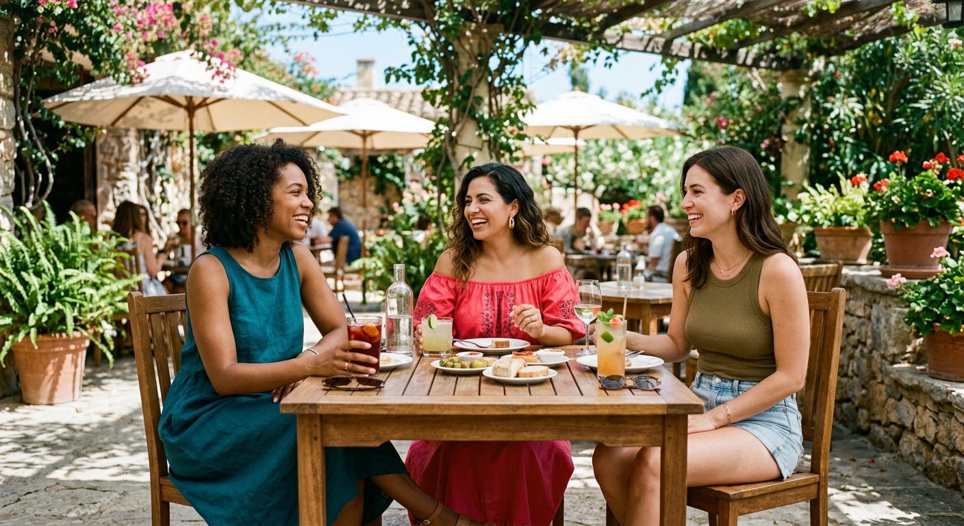
Deep seasons: Summer is perhaps the trickiest season for deeply-coloured palettes, because your best colours tend toward richness and depth, and those qualities can feel seasonally at odds with hot weather. Embrace your best lighter tones - a warm olive, a deep but clear teal, a rich coral rather than a dark burgundy - and save the deepest jewel tones for evenings when the temperature cooperates.
The real answer.
Honestly? Summer is the season that most rewards having already done a colour analysis, because it forces you toward exactly the clarity that a palette gives you. There’s no room to hide behind a great jacket or a clever scarf. It’s you, your skin, and whatever one or two layers you put on it. Having a clear shortlist of colours that reliably work means your “too hot to think about this” morning is no longer a random outcome. Grab from the pile, put it on, go. That’s the whole point.
You worked out your season so that summer mornings could be easier. Let them be.
A few more specific scenarios, because theory only goes so far.
The beach packing problem: Swimwear exists almost entirely outside the normal colour analysis conversation because it’s so context-specific, but cover-ups, sarongs, and beach-to-lunch pieces absolutely benefit from palette thinking. A warm Autumn who reaches for a coral cover-up will look radiant in the same photos where a cool Summer in that same coral looks slightly washed out. Pack beach layers with as much intention as your regular holiday clothes - they’re photographed just as often and worn just as close to your face.
The “I’m sweating through a silk blouse at a work event” scenario: Summer professional dressing is its own particular agony, made worse when you’re also trying to stay on-palette. Lightweight fabrics in your palette colours are the answer - a soft chambray, a fine linen, a very lightweight jersey - rather than trying to power through heat in heavier office-appropriate fabrics. Most workplaces are more tolerant of summer fabrics than people assume, and nobody looks professional while visibly overheating in the wrong material.
The festival and outdoor event situation: This is the context where the “proximity to face” rule does the most work. You’re wearing sunscreen, possibly a hat, definitely comfortable footwear, and the lighting is completely unpredictable. Keep your best colours at the top half - even just a well-chosen t-shirt in your most flattering hue - and don’t stress the rest. You’re at a festival. Some rules are allowed to take the day off.
Sunglasses frames: While not clothing, the colour of your sunglasses frames sits right next to your face all summer and benefits from the same undertone logic. Warm seasons tend to suit tortoiseshell, warm brown, gold, and warm metallics. Cool seasons tend to suit black, silver, cool grey, and clear or slightly smoky frames. This is a low-cost place to apply your season knowledge that pays off in every single outdoor photo of the summer.
One final thought on summer and self-compassion.
Summer is also the season where bodies are most on display, where social media is saturated with “summer looks” that bear approximately no resemblance to the average person’s actual summer, and where it’s easiest to fall into the trap of thinking that dressing well requires a certain body first. It doesn’t, and colour analysis is one of the more democratically useful style tools precisely because it’s about the relationship between colour and your face - not your size, not your shape, not anything other than the specific undertone and contrast already present in your own features. It works for everyone, at every size, in every summer. That’s the whole point.
Love the final paragraph!!