


Let’s talk about nails, because I think they’re one of the most underrated applications of colour analysis and also one of the most fun ones, partly because getting it wrong costs you a few bucks and a Saturday afternoon instead of $140 and a wardrobe regret that lingers until November.
Nails are where I tell people to experiment first. Test your seasonal palette in your polish choices before you commit to a full wardrobe shift. Go a bit bold. See how it feels to wear your season’s colours intentionally. Learn whether you love it or whether you need to revisit the guide, because nail colour is easier to remove than a sweatshirt and infinitely cheaper to buy than a coat.
That said, there is a real undertone logic to nail polish that most people navigate by vibe rather than by system, and once you understand it, you’ll probably look back at a few years of manicure choices and have a small, private “oh, that’s why” moment. I did.
The undertone rule applies here too, it just operates slightly differently.
Nail polish sits on your hands rather than near your face, which means the undertone stakes are meaningfully lower than they are for a top or a lip colour. The proximity-to-face rule we’ve talked about in other posts is your friend here: the further from your face, the more flexibility you have with colour. Your nails are quite far from your face. This is good news and it means you have real latitude to play.
That said, hands are visible. People notice your nails. And if you’re choosing between two similar shades at the polish wall and really cannot decide, the undertone rule is a perfectly good tiebreaker - go for the one that aligns with your undertone, all else being equal.
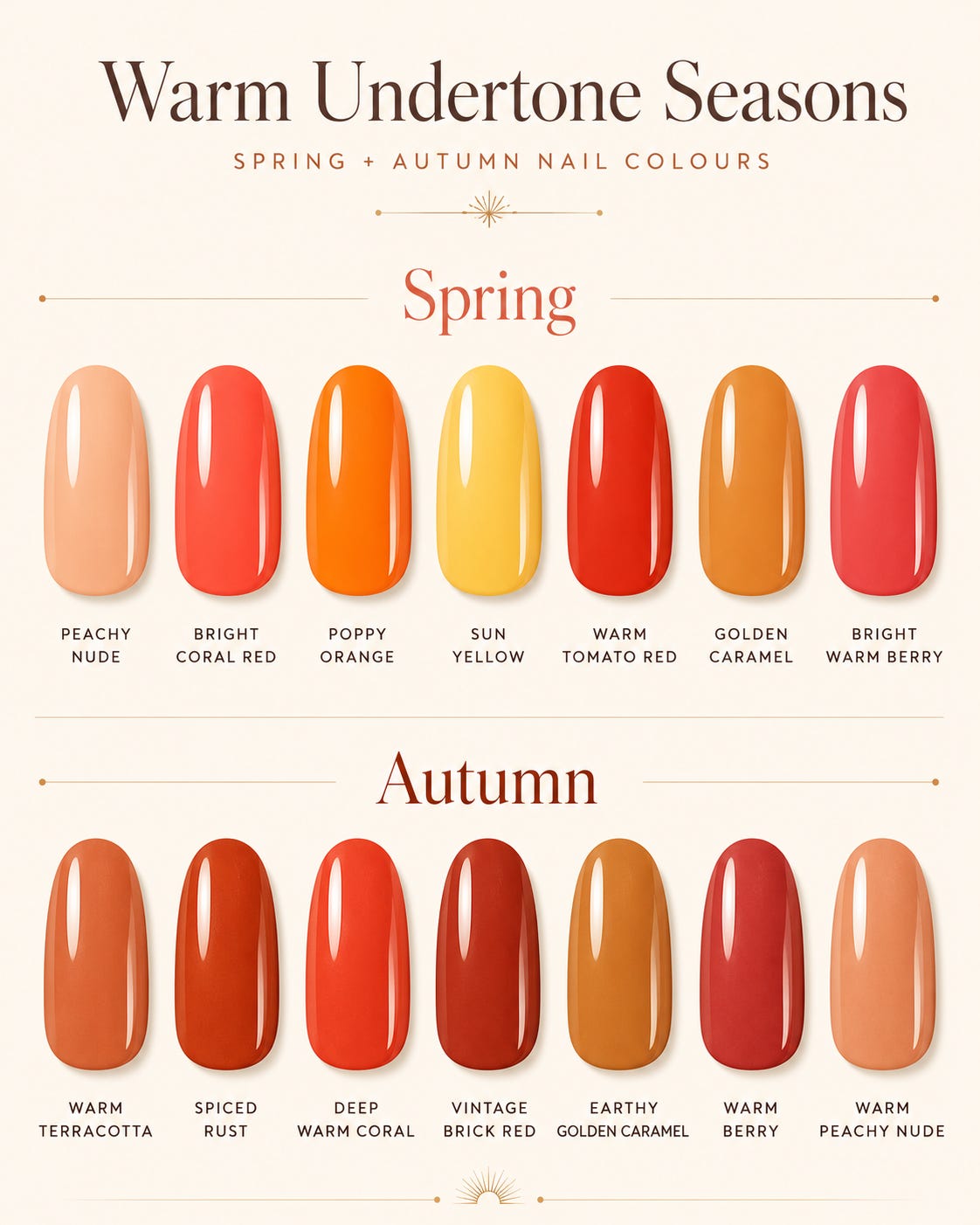
Warm-undertone seasons (Spring and Autumn): Your sweet spot sits in the warm end of the spectrum - peachy nudes, coral reds, warm terracottas, golden caramels, warm berry tones that lean red-orange rather than blue-red. Summer’s classic brights - the poppy oranges, the sun yellows, the warm tomatoey reds - are all firmly in your territory. If you’re a Spring, lean toward the brighter, cleaner version of these. If you’re an Autumn, go richer, more complex, earthier - a spiced rust, a deep warm coral, a vintage brick red rather than a vivid fire-engine one.
The shades to approach with a bit more thought: true blue-based reds (they can look slightly cold and disconnected against warm undertones), very cool-toned mauves (they can give hands a slightly greyish cast against warm skin), and anything with a strong blue or grey base. You can still wear them - nails, remember, are not a crisis if they’re slightly outside your palette - but if you want to know which shade in the display will look most harmonious, look for the ones that have warmth in them rather than the ones that read cold.
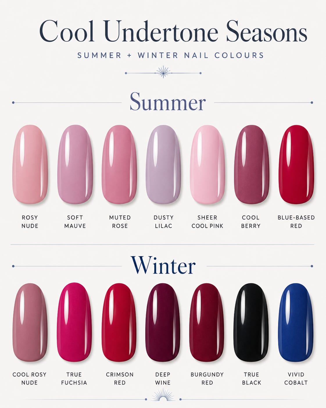
Cool-undertone seasons (Summer and Winter): This is where the classic “cool red” earns its reputation. A blue-based red - think more raspberry than tomato, more crimson than coral - is a natural, harmonious choice for cool seasons. So is a true fuchsia, a cool berry, a deep wine, and any of the blue-toned nudes (rosy, slightly pink, rather than peachy or golden). For Summers specifically, a soft mauve, a muted rose, a dusty lilac, or a sheer cool pink are all summer-specific colours that work beautifully without going too vivid. For Winters, you can carry full drama - a deep burgundy, a true black, a vivid cobalt - and look absolutely deliberate about it rather than like you grabbed the wrong bottle.
Neutral seasons: You have the most range. Your sweet spot tends to sit in the middle - not the most intensely warm, not the most starkly cool - and you can lean slightly either direction depending on your specific sub-season. A true neutral nude that reads neither golden nor pink is often a great base for neutral undertones, and from there you can experiment in both directions without anything looking very wrong.
A word about summer-specific nail colour trends, because summer always brings out the same few archetypes and they’re worth knowing how to navigate.
The tomato red moment: Every summer there’s a “tomato red” or “strawberry” phase. This is a warm red, firmly in Spring/Autumn territory. If you’re a cool season and you love the aesthetic, look for a version that reads slightly more toward raspberry than true tomato - still festive and summery but working with your undertone rather than against it.
The “glazed donut” or sheer neutral: Sheer nails in a very light, barely-there tone are endlessly popular in summer and highly wearable across most seasons. The key is the base tone of the sheer - even a light, sheer polish has an underlying warmth or coolness that affects how it reads against your specific skin tone. A sheer peach reads warm. A sheer pink reads cool. Look at the bottle in natural light.
Bright neons: Summer’s neon moment is fun and I’m not going to be the person who tells you not to wear a neon if you love it. Neons skew warm (yellow-greens, hot coral) or cool (electric blue, neon pink), so your usual tiebreaker still applies. Neons are also one of the situations where even I’d say: if it brings you joy, wear it, because the inherent fun of neon somewhat outweighs the undertone consideration.
French manicures: The white tip’s undertone matters more than most people expect. A warm or yellowish white tip looks quite different to a cool, blue-white tip, and the difference is particularly visible on cool-toned skin (where a warm white tip can look slightly yellowed) and warm-toned skin (where a stark white tip can look slightly clinical).
Finish and formula considerations.
Beyond colour, the finish of a polish affects how it reads. Glossy polishes are slightly more saturated and vivid. Matte polishes soften and mute any colour, which can be useful for seasons that suit more muted tones. Chrome and metallic finishes follow the warm-cool logic: gold chrome for warm seasons, silver chrome for cool, rose gold sitting interestingly in between (leaning warm). Sheer and jelly polishes soften everything, as mentioned, which can be either an asset or a drawback depending on your specific season.
The summary: nails are the lowest-stakes entry point into wearing your season with intention. Buy two or three polishes in your palette’s colours this summer and see how it feels. I promise that “wearing your actual season” is a sensation that gets addictive quickly, and starting at your fingertips is as good a place as any.
Gel versus regular polish: does the format change anything?
The short answer is not much, in terms of colour undertone - a warm coral is a warm coral whether it’s in a regular lacquer or a gel formula. Where format does make a small difference is in depth and intensity: gel polishes tend to appear slightly more saturated and vivid than the same colour in regular polish, because the finish is glossier and the pigment is suspended differently. This means that if you’re choosing between a regular polish and its gel equivalent, the gel version will read as very slightly more intense - which can be an asset for seasons that suit vivid, saturated colours, and worth keeping in mind for softer or more muted seasons where that extra intensity might push a colour slightly further than you intended.
Gel also tends to photograph a little more dramatically because of the sheen level. If nail photos are something you do - for your own records, for content, just for fun - gel will give you the higher-impact visual. Regular polish is kinder on your nails long-term and easier to change at home when the colour obsession strikes at 10pm on a Tuesday.
A quick summer-by-season colour shortlist, for when you want a starting point.
True Spring: Clear coral, warm peach, light golden yellow, bright warm red, fresh melon. Light Spring: Very light peach, warm ballet pink, soft coral, champagne shimmer. Warm Spring: Bright warm tomato red, golden orange, clear turquoise, warm coral. True Summer: Soft rose, dusty mauve, muted raspberry, cool lavender, sheer cool pink (hi, it me). Light Summer: Pale pink, soft lavender, barely-there blush, cool lilac. Soft Summer: Muted berry, dusty rose, greyed-pink, soft plum. True Autumn: Warm terracotta, brick red, olive, spiced copper, deep warm coral. Soft Autumn: Warm dusty rose, muted olive, soft terracotta, warm caramel. Deep Autumn: Rich burgundy, dark chocolate, deep warm red, forest green. True Winter: Blue-red, deep fuchsia, true black, bright white, jewel-toned cobalt. Bright Winter / Clear Winter: Vivid fuchsia, icy lavender, true red, electric blue. Deep Winter: Deep burgundy, black cherry, navy, dark plum.
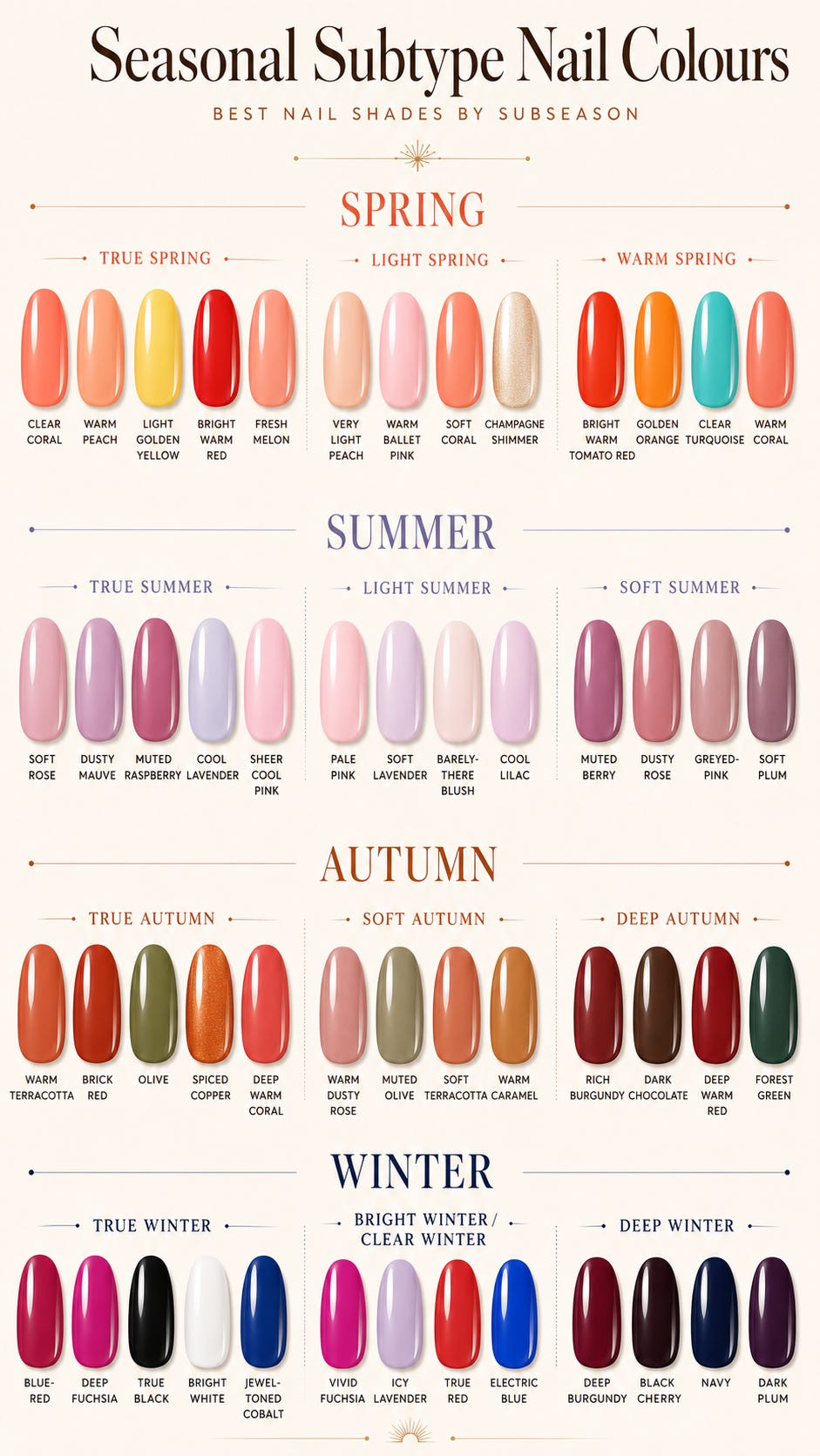
Take these as starting points rather than hard rules - nail polish can always be tested on a swatch card or against your wrist before committing, and most polish brands have return policies for unopened bottles if a colour doesn’t land the way you expected. ◡̈