


Online shopping is where colour analysis goes to die, and I say that with love, because I have absolutely ordered a “cream” jumper that arrived looking distinctly yellow and ruined an otherwise lovely outfit. Online shopping strips away almost every reliable cue you’d normally use to judge a colour in person, and replaces it with lighting decisions made by someone whose entire job is to make the product look as appealing as possible, accuracy be damned. Here’s how to actually read undertone in a product photo before you commit, gathered from a fairly extensive amount of personal trial and error.
Distrust the product title, completely. “Cream,” “ivory,” “off-white,” “bone,” “stone,” “oatmeal” - these words are doing almost no useful work. Brands name colours for vibe, not accuracy. A “cream” from one retailer can be warm and golden; a “cream” from another can be cool and almost grey, practically indistinguishable from a pale lilac-white. Treat the name as marketing copy, not data, the same way you’d treat “rustic” on a restaurant menu as a vibe rather than a factual description of the building.
Zoom into the product photo and look at the shadows, not the brightest highlight. Lighting in product photography is often warmed up deliberately to look inviting, which flatters the photo but lies to you about the actual colour. Shadowed folds in the fabric - where it bunches at a sleeve, where a hem creates a crease - tend to reveal the true undertone more honestly than the brightly lit flat areas, because the warming filter or lighting setup affects highlights more dramatically than shadows. If you only look at the brightest, most evenly lit section of the photo, you’re looking at the part of the image that’s been most aggressively flattered.
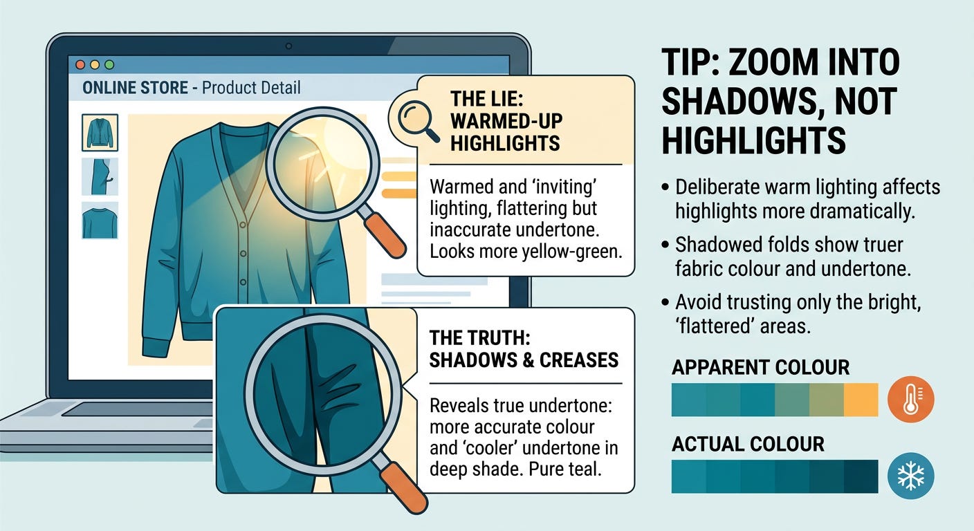
Check for a “true colour may vary” disclaimer or a lifestyle/model shot in natural light. Many retailers include at least one image shot outdoors or in a more neutral setting alongside the polished studio shot. Compare the two directly, ideally side by side in separate browser tabs. If the colour looks notably different between them, that’s your warning sign that the studio shot has been warmed or cooled for appeal, and the natural-light shot is the more trustworthy one.
Look at the undertone of other colours in the same photo as a reference point. If a product shot includes the model’s skin, hair, or other neutral background elements, you can sometimes cross-reference — does the white background look truly neutral, or does it have a yellow or blue cast? If the white background isn’t reading as true white, every other colour in that photo is being skewed the same direction, and you can roughly mentally correct for it. This is a useful trick once you start doing it habitually; you start noticing warming or cooling filters on product photography almost everywhere, and it becomes hard to unsee.
Read reviews for colour complaints specifically. This sounds obvious, but it works shockingly well. Search the reviews page for words like “mustard,” “more yellow than pictured,” “looked grey in person,” or “not as advertised.” Real customers in real lighting, photographing the item on their own phones in their own homes, are more reliable than any single studio photo, almost without exception. I’d personally rate a handful of honest customer review photos above the official product images for colour accuracy purposes (thanks to them for taking the hit for me, haha).
Check if the retailer offers a colour-matching swatch or fabric sample service. Some retailers, particularly for higher-cost items like coats or formalwear, will send a small fabric swatch before you commit to the full purchase. If this is available and you’re investing real money in a piece, it’s worth the small delay and minor cost. There is no substitute for seeing the actual fabric under your own lighting.
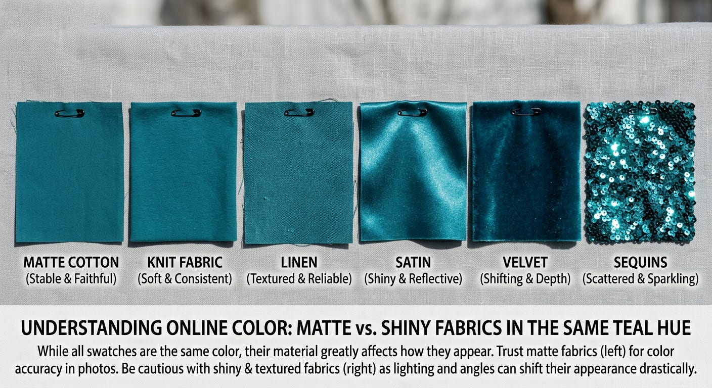
Consider the material itself, not just the colour name. Matte fabrics (cotton, most knits) tend to render their true colour more faithfully in photos than shiny or textured ones (satin, sequins, velvet), which can scatter light in ways that shift the apparent colour depending on the angle of the shot. If you’re choosing between two similar colours in different fabric finishes, lean toward trusting the photo more for the matte option and being more cautious with the shiny one.
When in doubt, order it and check it against your palette guide in natural daylight near a window, with the tags on, before removing them. Returns exist for exactly this reason. I’d really rather you order two options and send one back than keep something that’s quietly working against you every time you wear it. Don’t let the minor hassle of a return talk you into keeping something you’re already unsure about - the cost of an awkward returns process is significantly lower than the cost of a garment sitting unworn in your closet for two years because it never quite felt right.
The skill here isn’t becoming paranoid about every online purchase - it’s building a habit of pausing at the highlight-versus-shadow check before you click “add to cart.” That one habit alone will save you more wardrobe regret than almost anything else on this list, and it takes about fifteen extra seconds once it becomes automatic.
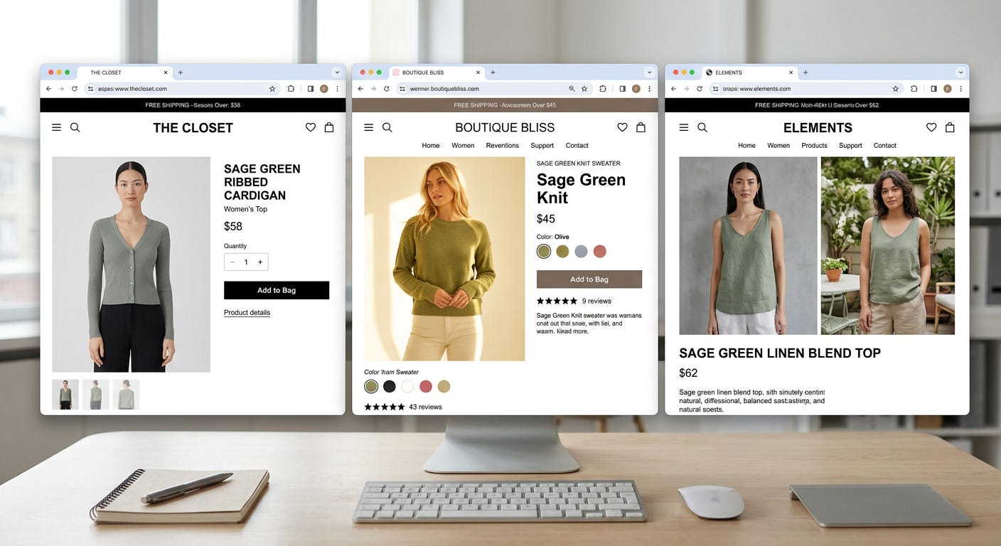
A worked example, because the abstract advice lands better with a real scenario attached. Say you’re shopping for a “sage green” cardigan online for a Soft Summer palette. You pull up three retailers, all calling their cardigan “sage.” Retailer one’s studio photo shows a fairly grey-green, photographed in flat, even, slightly cool lighting. Retailer two’s photo shows a noticeably more golden, yellow-leaning green, shot in warm studio lighting with strong highlights. Retailer three has both a studio shot and an outdoor lifestyle shot, and the two images look almost identical in tone, which is itself a good sign of accuracy. Without doing any further digging, retailer three’s listing is already the safest bet, simply because the consistency between their two different lighting setups suggests less aggressive colour correction is happening. If you wanted to go a step further, you’d check the shadowed fold of fabric in retailer two’s photo specifically, since that’s where the warming filter is least likely to be hiding the true colour, and compare that shadowed tone against what a cool-toned sage should look like.
One more thing worth mentioning: screen calibration is a real, if slightly nerdy, variable too. Your own device’s display affects how you perceive any colour you’re looking at, product photo or otherwise. Phone screens in particular often run slightly warm or oversaturated by default to make photos look more appealing generally, which compounds the product photography lighting issue rather than correcting for it. If you’re making an important colour decision - a wedding outfit, say - it’s worth double-checking the colour on a second device, ideally a properly calibrated laptop or desktop monitor rather than relying purely on your phone, just to rule out your own screen as a confounding variable before you commit to a purchase you can’t easily return.
A handful of smaller, faster habits worth building alongside the bigger checks above. Search for the product on a second retailer if it’s a popular item carried in multiple places; sometimes you’ll get a more honestly lit photo from one seller than another for what is technically the same garment. Check the product’s available colour options listed together on one page if the retailer offers a colour-swatch row; seeing your intended shade directly next to its siblings often reveals undertone more clearly than seeing it in isolation, the same way it’s easier to spot a slightly-off paint colour when you’ve got several chips lined up side by side rather than just one in front of you.
And finally, don’t underestimate the simple trick of squinting slightly at a product photo, or stepping back from your screen. Reducing visual detail temporarily forces your eye to register the overall colour cast more honestly, without getting distracted by the fine textile detail and styling that’s doing its best to charm you into not noticing the lighting trick underneath. It sounds almost too simple to be useful, but it’s an effective, completely free habit worth building.
None of this needs to turn online shopping into a research project every single time. Most purchases are low-stakes enough that a quick glance and a reasonable returns policy are protection enough. Save the fuller checklist for the items that actually matter to you - the pieces you’re hoping to wear constantly, close to your face, for years to come.
The broader point underneath all of this is one of patience over impulse. Online shopping is designed, deliberately, to encourage fast decisions - a tempting photo, a countdown timer, an “only three left in stock” nudge. Slowing down just long enough to check a shadowed fold of fabric or a second product photo runs slightly against the grain of how these platforms want you to behave, which is exactly why it’s worth building into a deliberate habit rather than trusting it’ll happen naturally in the moment.